Theme Documentation
Support and documentation
Welcome to the Yuva user documentation.
Browse the support documentation to set up the Yuva theme and built-in modules quickly.
Support hours
- Monday – Friday (excluding Indian public holidays)
- 09:30 – 18:30 IST (Indian Standard Time)
Theme editor
For general guidance with modifying sections, refer to Shopify help: Sections and blocks (opens new window).
Announcement bar
The announcement bar is an optional section, when enabled, it permanently sits at the top of every page on your website. This feature can keep your customers informed of upcoming sales, newly launched products, and promotional discounts. You can also configure a sales countdown timer to display the duration of the sale. You can set the timer to display specific hours, days, or months for which the sale will be on.
Note: You can edit and make changes to the announcement bar on all page templates, excluding the Checkout, Password, and Gift card page templates.
Configure the announcement bar section
- Go to Customize theme. At the top of the page, click on the dropdown to select the Home page template.
- From the left side menu, select the Announcement bar.
- Customize this section using the settings shown in the following table.
| Enable announcement bar | Select the checkbox “Enable announcement bar” to show or hide the announcement bar. | ||
| Show close icon | Select the checkbox “Show close icon” to display the close button. | ||
| Icon | Select the desired icon from multiple icons given in the dropdown. | ||
| Text | Heading | In the “Heading” box, enter some text that will be displayed on the left side of the sales counter.
For example – The sale starts on. |
|
| Countdown date | Enter Sale end date in “DD/MM/YYYY” format. It will show the counter in “Hours:Min:Sec” till the date given in the textbox.
Please note that the countdown date must be set to a future date and include the following format: DD/MM/YYYY Example: 20/08/2022 |
||
| Button | Text | Enter text to display over the button. | |
| Link | In the “Link box,” enter a url to redirect the button. On clicking the button, it will redirect visitors to the added page. Both the button name and link need to be added to display the button. | ||
| Colors | Text | Select any text color for the text in the Announcement bar. | |
| Background | Background style | Select from two background styles – solid and gradient. It shows the background color accordingly. | |
| Solid | Select any color as the solid background color of the Announcement bar. | ||
| Gradient | Select any color as the gradient background color announcement bar. | ||
| Button | Background | Select the button’s background color. | |
| Text | Select the button’s text color. | ||
| Border | Select the button’s border color. | ||
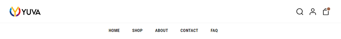
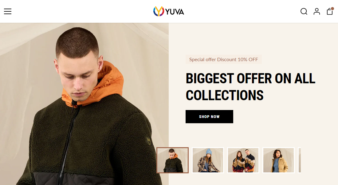
Header
Three primary navigation types are provided with the Yuva theme:
- Logo left, menu center


- Logo center, hamburger menu

- Full width menu

Configure the header section
- Go to Customize theme. Click on the top dropdown menu to select the Home page template.
- From the side menu, select Header.
- Configure the “Header” in the setting on the right side with the following settings.
Enable sticky header
Enable/disable the Sticky header checkbox to turn it on/off, keeping the header at the top of the page.
| Navigation type | Select the preferred header from the dropdown menu:
|
|
| Enable search | Enable/disable the search checkbox to show/hide the search feature inside the Header. | |
| Logo | Image | Use the logo selector option to set up an image to use as a logo inside the Header. The recommended image dimensions are 110px x 36px (pixels).
|
| Custom logo size | Adjust the slider Custom logo size to set a size for the logo image between 50px and 250px (pixels). | |
| Logo alignment | Set the store logo to the left side or to the center of the header.
Note: This setting applies only to the full-width Menu Header style. |
|
| Navigation | Menu | This feature will help you import menus from Shopify’s default navigation list that is available in the backend. It will be displayed as the menu in the Header. Refer to Configure the header menu. |
| Menu alignment | Set the menu to the left side or to the center of the header.
Note: This setting applies only to the full-width Menu Header style. |
|
| Colors | Background | Set the background color of your Header.
Note: This background color does not apply to the “Logo center, hamburger menu & the mobile hamburger.” |
| Text | Set the color of the Header text, including menu text, search icons, etc.
Note: This text color does not apply to the “Logo center, hamburger menu & the mobile hamburger.” |
|
| Hover text | Set the color that appears when a user hovers over the Header items.
Note: This hover text color does not apply to the “Logo center, hamburger menu.” |
|
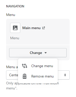
Configure the header menu
To select a menu to be displayed inside the Header section, apply the following settings in Header > Menu.
- To edit the current menu, click on the Edit menu link. This link will open the Navigation menu editor in the Shopify admin. panel. This editor is used to modify the menu. You can refer to Shopify help: Add, remove, or edit Menu items in your online store.
- To create the new menu, click on Change > Change menu, and follow the Create menu link. The link opens the Navigation > Add menu page in the Shopify admin. You can use the Menu editor for creating a new Menu, and then click on the New menu. For detailed understanding, click here Shopify help: Add, remove, or edit Menu items in your online store.
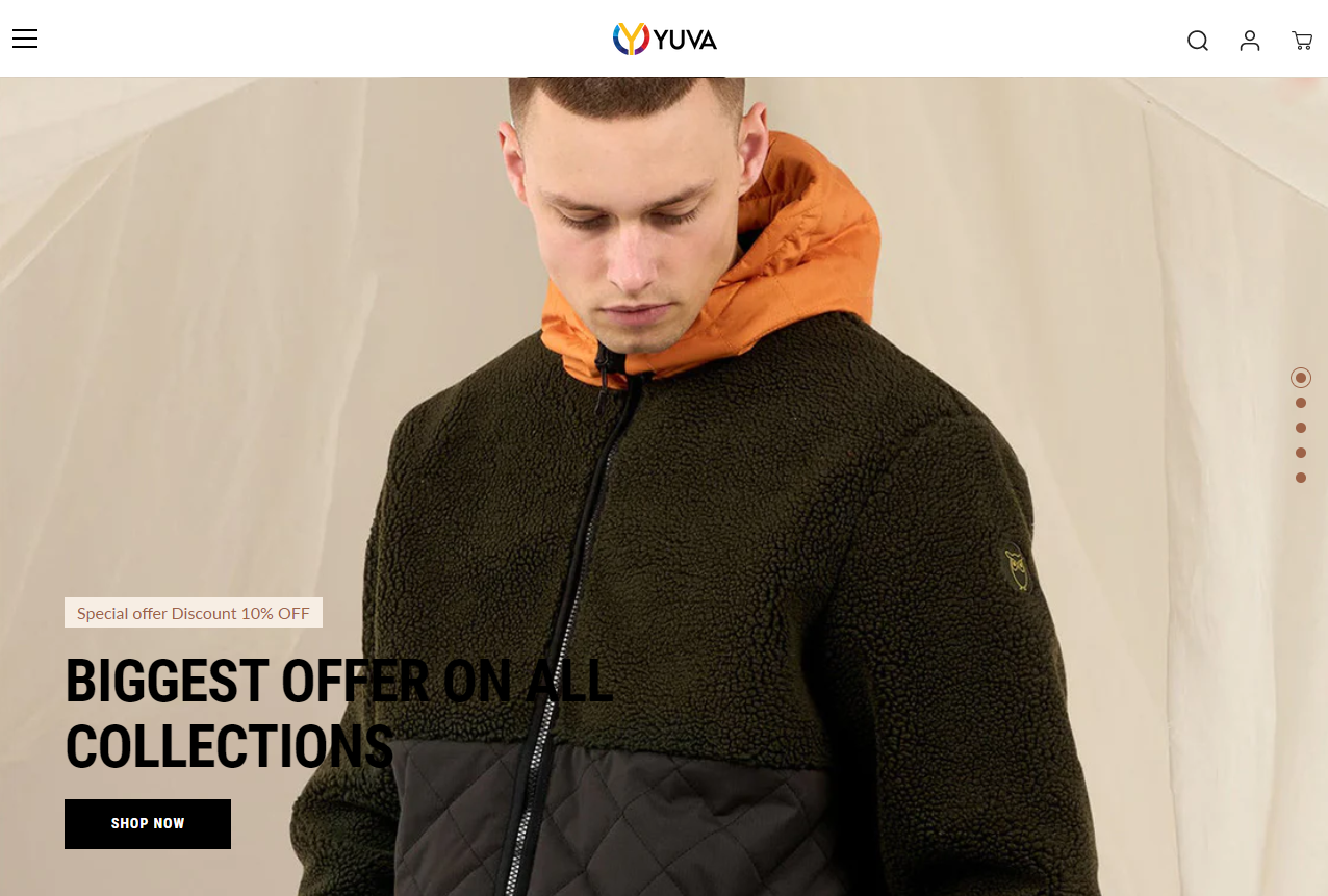
Slideshow
This section is used to add a slideshow to your home page. Users can add up to 5 slides. Each slide has its own settings for better visualization and engagement.
We provide the following two styles for the slideshow. The selected type will be applied to all slides.
- Split – This allows users to show thumbnails/small images on a split slide.
- Full-width – This allows users to add a standard slideshow with text content.
Configure the slideshow
- Go to Customize theme. At the top of the page, click on the dropdown menu to select the Home page template.
- From the left side menu, select “Slideshow.”
- Click on the dropdown arrow beside the slideshow section.
- Click “Add Slide.”
- Customize this section by using the setting on the right side of the theme editor, as described in the following table.
| Style | Select split or full width from the dropdown at the right top corner. |
| Auto-rotate slides | Select this checkbox to enable/disable the Auto-rotate slides” option in the slider. It keeps changing slides automatically on the storefront. |
| Change slides every | This setting will only work when the “Auto-rotate slides” option is enabled. And, it only provides a range of 3 to 10 seconds. |
Block settings
| Image | Select an image to show in the mobile view.
Please note that an image size of 1117 x 844px (pixels) is recommended for style “Split” and 1920 x 844px (pixels) recommended for “Full-width”style. |
|||||||||||
| Mobile image | Select an image to show in the mobile view.
Please note that an image size of 550 x 660px (pixels) is recommended. |
|||||||||||
| Text |
|
|
||||||||||
| Button |
|
|
||||||||||
| Desktop colors |
|
|
||||||||||
| Mobile colors |
|
|
||||||||||
Note: These settings will be common for both slideshow styles.
News ticker
This section will show important announcements or promotional text in rotating form. With the Yuva theme, text in two rows can be added here.

Configure a news ticker
- Go to the Customize theme. At the top of the page, click on the dropdown menu to select the Home page template.
- From the side menu, select “News ticker.”
- Customize this section by using the setting on the right side of the theme editor, as described in the following table.
| Text |
|
|
||||||||
| Colors |
|
|
||||||||
| Section spacing |
|
|
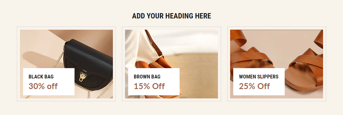
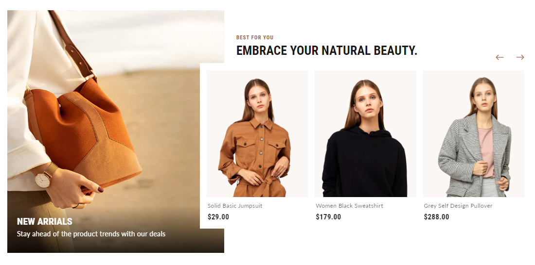
Image gallery
This section represents the image gallery. Users can add up to 6 images to the gallery.
Configure the section
- Go to Customize theme. At the top of the page, click on the dropdown menu to select the Home page template.
- From the left side menu, select “Image gallery.”
- Select the arrow beside the Image gallery section.
- Click “Add Image.”
- Customize this section by using the setting from the right side of the theme editor as described in the following table.
| Heading | Enter text to display as a title on the Image gallery. For example: “Brand-new collection.” | |||||||||
| Show dotted outline on desktop | Select this checkbox to show/hide the dotted outline around each image in the section. | |||||||||
| Section spacing |
|
|
||||||||
Block setting
The block settings below are common to all images.
| Heading | Enter text to be displayed as a title on the image box. For example: “Men collection.”
Note: We recommend adding 30 characters max to make an appealing UI. |
| Subheading | Enter text to display as a subtitle on the image box.
Note: We recommend adding 30 characters max to make an appealing UI. |
| Background Image | Select a background image for the image box. Image size of 484 x 284px (pixels) is recommended. |
| Link | Enter a url to redirect the image box. The link opens when a store visitor clicks on this image box. |
Collection list
The Yuva theme offers a collection list, where different collections are displayed in slider layouts. Here you can add a maximum of five collections.
The collection list has two styles:
- Content left, grid right
- Content top, grid bottom
Configure the collection list
- Go to Customize theme, and at the top of the page, click on the dropdown menu to select the Home page template.
- From the left side menu, select “Collection list.”
- Select the arrow beside it.
- Click “Add Collection” to add the blocks.
- Customize this section by using the setting on the right side of the theme editor, as described in the following table.
| Style | Select any preferred style from the given two different styles:
|
|||||||||
| Text |
|
|
||||||||
| Button |
|
|
||||||||
| Section spacing |
|
|
||||||||
Collection list block settings
| Collection | Select any collection to display in the carousel. |
| Custom image | Select the image for your collection, or else the collection image will be displayed by default. Image size of 394 x 530px (pixels) is recommended. |
| Heading | Enter text to display as a title on the collection block, or else the default collection title will be displayed by default. |
| Subheading | Enter text to display as a subtitle to the collection block, or else the default collection content will be shown by default. |
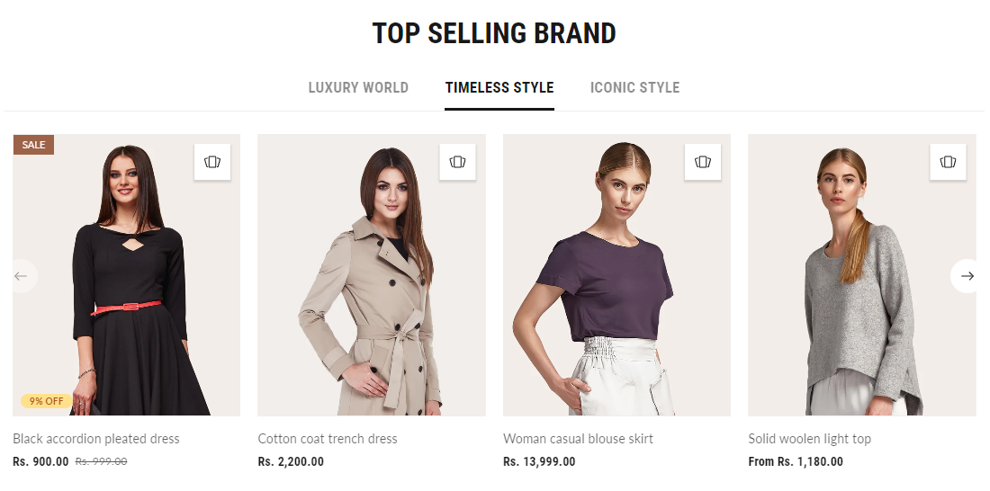
Collection tabs
Yuva theme provides collection tabs that help users to display their three product collections under these tabs. In addition, the Collection tab can be configured using the settings below.
Configure the collection tabs
- Go to Customize theme. At the top of the page, click on the dropdown menu to select the Home page template.
- From the left side menu, select “Collection tabs.”
- Select the arrow beside it.
- Click “Add Collection” to add the tabs.
- Customize this section by using the setting on the right side of the theme editor, as described in the following table.
| Heading | Enter text to display as a title on the collections tabs. | |||||||||
| Section spacing |
|
|
||||||||
Collection tabs block settings
| Tab heading | Enter text to display as a title of the tab, or the collection name will display by default. |
| Collection | Select any collection to display its list of products.
Please note that the tab will only be visible if the selected collection contains at least one product. |
Featured collection
This section displays products from the selected collection. Customize this section by adjusting the content & number of products to show at once in this slider.
Configure the featured collection
- Go to Customize theme. At the top of the page, click on the dropdown menu to select the Home page template.
- From the left side menu, select “Featured collection.”
- Customize this section by using the setting on the right side of the theme editor, as described in the following table.
| Collection | Select the collection to display its product list. | |||||||||
| Maximum products to show | Set the number of products to display using the product count slider. A minimum of 3 and a maximum of 15 products can be selected here. | |||||||||
| Text |
|
|
||||||||
| Custom content |
|
|
||||||||
| Section spacing |
|
|
||||||||
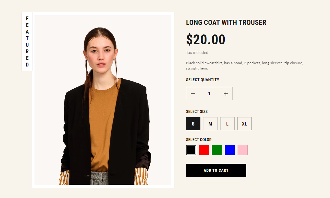
Featured product
This section shows the best products in the store as a mini page on the front of the store.
Please note that all other blocks except “Text” & “Custom liquid” can be added only once.
Configure featured product
- Go to Customize theme. At the top of the page, click on the dropdown menu to select the Home page template.
- From the left side menu, select “Featured product.”
- Customize this section by using the setting on the right side of the theme editor, as described in the following table.
| Heading | Enter text to display on the left side of the featured product image box.
Please note that a maximum of ten characters can be added to make the UI appealing. |
|||||||||
| Product | Select any product to showcase in the featured product section. This product can be changed/removed at any time using the change button. | |||||||||
| Section spacing |
|
|
||||||||
Featured product blocks
| Title | It displays the selected product’s title inside the Featured product section. It has no customizable block settings available. |
| Text | Enter any additional text to display in this featured product section. To display dynamic data, like product Title or Vendor, select the Insert dynamic source icon shown next to the Text box and select any metafield to add here.
For more understanding, refer to Metafields. |
| Review rating | Show customer reviews and ratings for the particular product. |
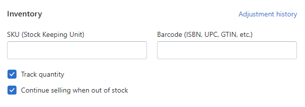
| SKU | It displays the product’s SKU. Refer to Product details. |
| Price | It displays a product’s price inside the “Featured product” section. It has no customizable block settings available. |
| Variant picker | Displays a variant picker for selecting variants of a product inside the “Featured product” section. It has no customizable block settings available.
Please refer to Theme settings > Product for the different variants styles (Dropdown and Color swatches). |
| Quantity selector | It displays a quantity selector, inside the featured product section, for choosing the number of products to purchase. It has no customizable block settings available. |
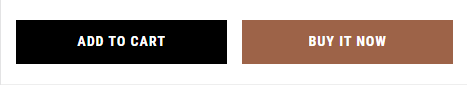
| Buy button | It shows the “Add to cart” and “Buy now” buttons in the featured product. Select checkbox “Show dynamic checkout button” checkbox to show a button with the user’s preferred payment method, in addition to “Add to cart” button, inside the featured product section.
For more understanding, refer to Dynamic checkout button. |
| Social sharing | Select to add social icons for sharing the product on them. |
| Custom liquid | This section is used to add the custom liquid code for any advanced customizations like app snippets. Refer to Shopify developers: Custom liquid reference (opens new window). |
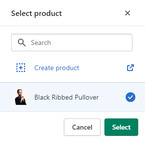
Add products in the featured product section
To add a product to the featured product section, follow these guidelines:
- Go to Featured product > Product, choose Select product, and then select one of the following options.
- To find a product, type the product’s name in the Search text box, select product and then click on Select.
- To create a product, select Create product to open the Add product menu on the Shopify store’s admin page.
Modify products in the featured product section
To modify a product in the featured product section, follow these guidelines:
Edit a product’s details
Click on the link shown next to the selected product in the editor. This link opens the product editor on the Shopify store’s admin page. Use the editor to modify the product details.
For more understanding, refer to Product details
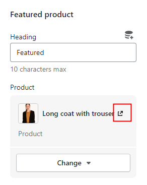
Change product
Click on Change dropdown, select Change product, and then select one of the following options.
- To find a product, type the product’s name in the Search text box.
- To create a product, select Create product link to open Add product menu on the Shopify store’s admin page and enter products’ details.
For more understanding, refer to Shopify help: Adding and updating products.
- Select the required product from the list of products, and click on the Select button.
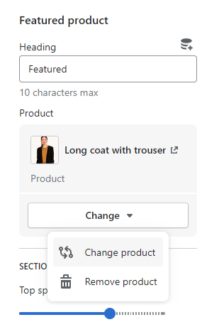
Remove a product from the section
Select the Change dropdown, and then choose Remove product.
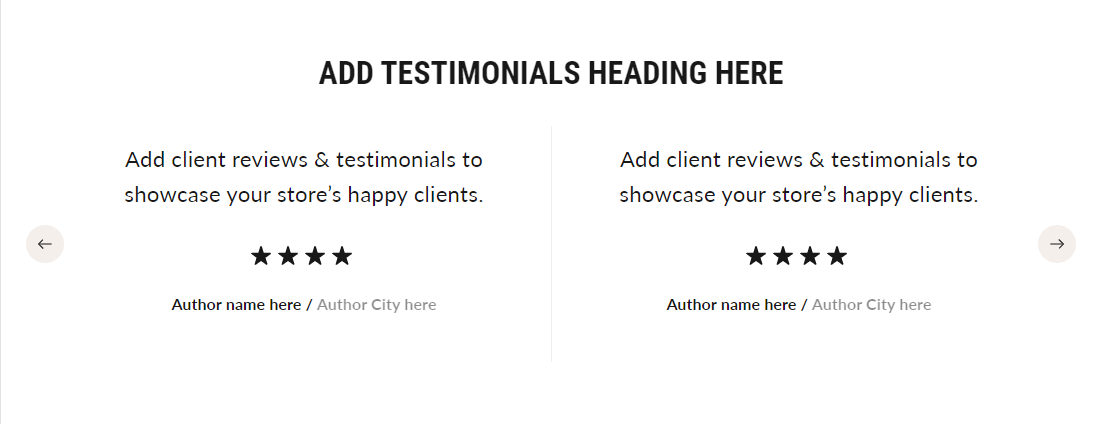
Testimonials
This section is used in the form of a slider to add reviews and feedback from happy customers. You can add up to 5 quotes under this section. There are two styles of testimonials:
- One column
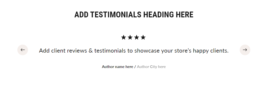
- Two columns
Configure the testimonials
- Go to Customize theme. At the top of the page, click on the dropdown menu to select the Home page template.
- From the left side menu, select “Testimonials.”
- Click on “Add Quote” to add the blocks.
- Customize this section by using the setting on the right side of the theme editor, as described in the following table.
| Testimonials style | Choose the style in which you want to show your testimonial section. For instance, you can choose ‘one column’ or ‘Two columns’ as per your preferences. | |||||||||
| Carousel navigation | Select arrows or dots to navigate through the carousel. | |||||||||
| Section spacing |
|
|
||||||||
Quote settings
The common settings to set up quotes are as follows:
| Heading | Add heading text to display the client’s feedback/message. |
| Description | Add the feedback/message given by the customer about the product. |
| Author | Add text to display the name of the author/client. |
| Author city | Add the city name where the author/client lives. |
| Author image | Select the image of the author/client. You can change or remove it using the change button.
Note: An image size of 90 x 90px (pixels) is recommended. |
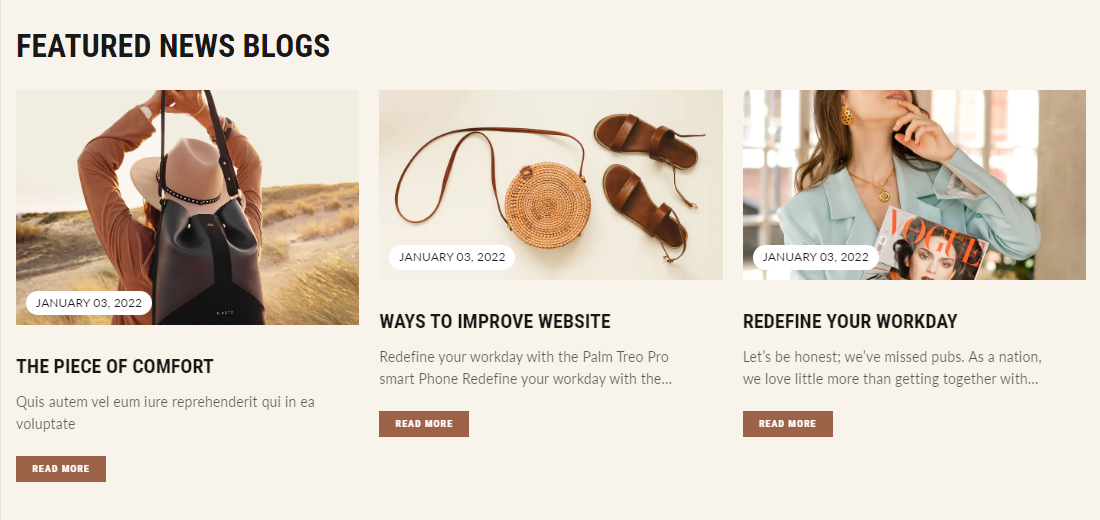
Featured posts
This section shows the list of recent blogs on the home page. Up to 3 posts can be added here. Users can use these blog posts to write about new products, collections, promotions, or other news.
Configure the featured posts section
- Go to Customize theme. At the top of the page, click on the dropdown menu to select the Home page template.
- From the left side menu, select “Featured posts.”
- Click on “Add Post to add the blocks.
- Customize this section by using the setting on the right side of the theme editor, as described in the following table.
| Heading | Enter the text to be displayed as the title on the Featured Posts section. | ||
| Button |
|
||
| Enter text to display over the button. |
| Add a link to redirect the button to the specified page. The link opens when a store visitor clicks on this button. Both the button name and link need to be added to display the button |
Section spacing
| Top spacing (desktop) |
| Bottom spacing (desktop) |
| Top spacing (mobile) |
| Bottom spacing (mobile) |
| Adjust the slider to add spacing at the top of the section on the desktop. |
| Adjust the slider to add spacing at the bottom of the section on the desktop. |
| Adjust the slider to add spacing at the top of the section on the mobile. |
| Adjust the slider to add spacing at the bottom of the section on the mobile. |
Featured posts block settings
There is a similar setting for all three blocks –
| Select post | Select the article.
|
Countdown with images
This section displays customized images of products or collections on sale at the sales counter.
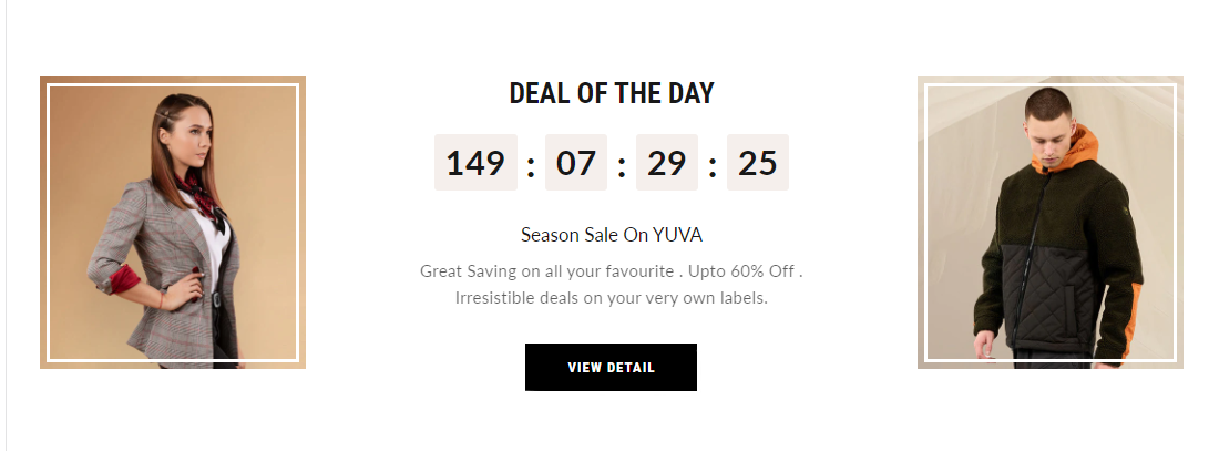
Configure the countdown with images
- Go to Customize theme. At the top of the page, click the dropdown to select a Home page template.
- From the left side menu, select “Countdown with images.”
- Customize this section by using the setting on the right side of the theme editor, as described in the following table.
| Heading | Enter text to display as a title to attract the store visitors. | |
| Subheading | Enter text to display as a subtitle. | |
| Description | Enter text providing sales and offering details to the customers. | |
| End date | Enter the sale end date in the DD/MM/YYYY format for the timer. It must be set to a future date, as it will specify the sale period. | |
| Button | Text | Enter text to display over the button. |
| Link | Enter a url to redirect the button. The link opens when a store visitor clicks on this button. Both the button name and link need to be added to display the button. | |
| MEDIA | Left image | Select an image to show on the left side of the timer.
Note: Image size of 410 x 450px (pixels) is recommended. |
| Right image | Select an image to show on the right side of the timer.
Note: Image size of 410 x 450px (pixels) is recommended. |
|
| Section spacing | Top spacing (desktop) | Adjust the slider to add spacing at the top of the section on the desktop. |
| Bottom spacing (desktop) | Adjust the slider to add spacing at the bottom of the section on the desktop. | |
| Top spacing (mobile) | Adjust the slider to add spacing at the top of the section on the mobile. | |
| Bottom spacing (mobile) | Adjust the slider to add spacing at the bottom of the section on the mobile. | |
Text with icons
This section is used to display informational banners. You can add a maximum of 4 blocks under this section.
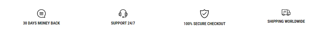
Configure the text with icons
- Go to Customize theme. At the top of the page, click on the dropdown menu to select the Home page template.
- From the left side menu, select “Text with icons.”
- Customize this section by using the setting on the right side of the theme editor, as described in the following table.
| Section spacing | Top spacing (desktop) | Adjust the slider to add spacing at the top of the section on the desktop. |
| Bottom spacing (desktop) | Adjust the slider to add spacing at the bottom of the section on the desktop. | |
| Top spacing (mobile) | Adjust the slider to add spacing from the top of the section on the mobile. | |
| Bottom spacing (mobile) | Adjust the slider to add spacing at the bottom of the section on the mobile. |
Text block settings
The common settings for the block having text with icons are:
| Icon | Add a relevant icon to your block. It has a list of icons available in the dropdown. |
| Heading | Add a heading to your block. |
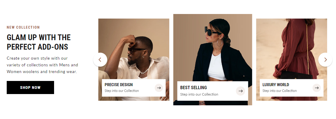
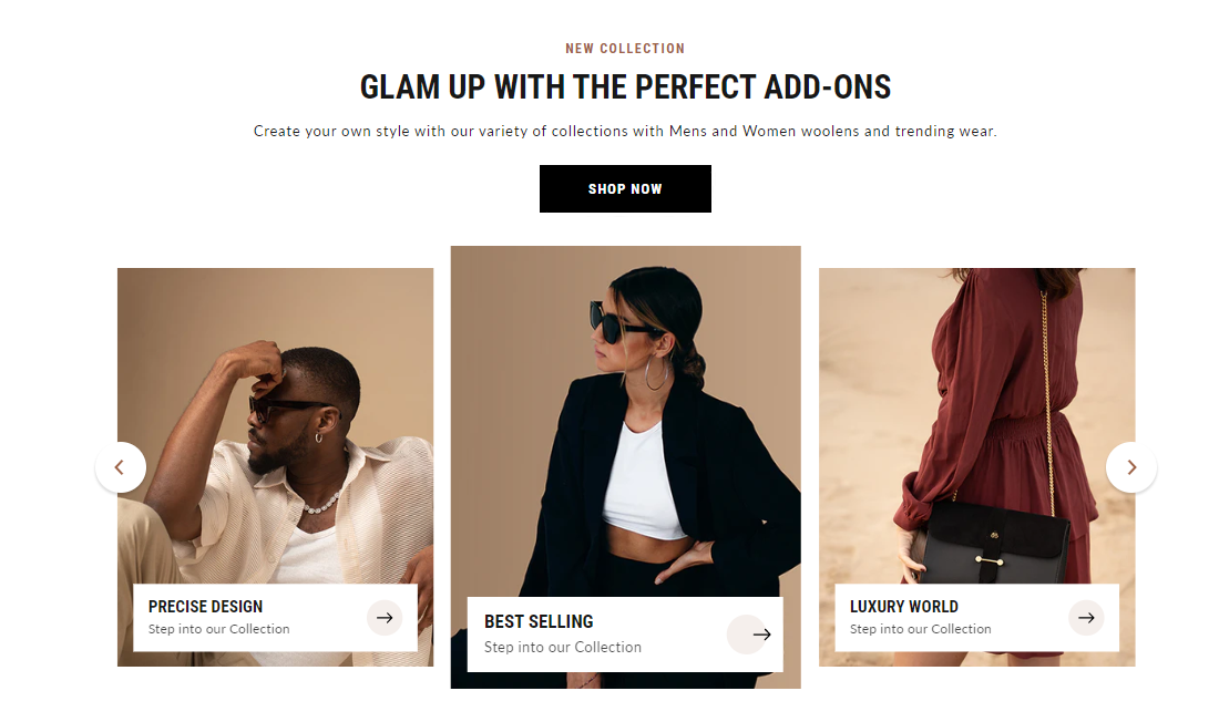
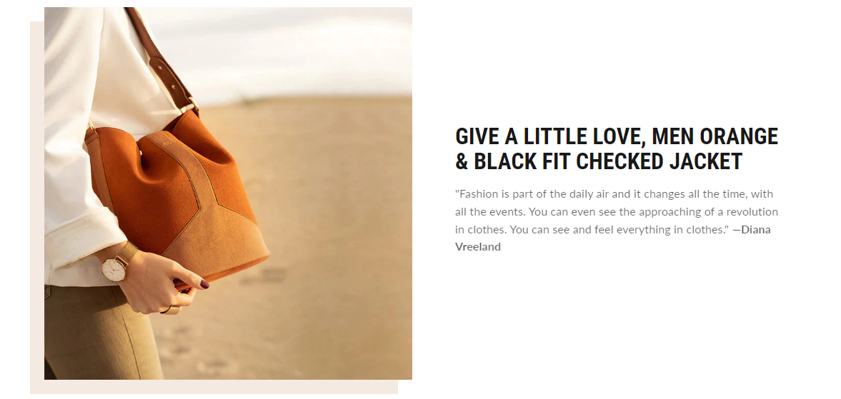
Image with text
Users can use this section to add two images with text to showcase stories or to show any kind of text content.
Configure the image with the text section
- Go to Customize theme. At the top of the page, click on the dropdown menu to select the Home page template.
- From the left side menu, select “Image with text.”
- Customize this section by using the setting on the right side of the theme editor, as described in the following table.
| MEDIA | Image 1 | Add any image to showcase on the left side.
Note: An image size of 550 x 510px (pixels) is recommended. |
| Image 2 | Add any image to showcase on the right side.
Note: Image size of 295 x 315px (pixels) is recommended. |
|
| Image alignment | Select the left or right alignment of the images from the dropdown. | |
| Section spacing | Top spacing (desktop) | Adjust the slider to add spacing from the top of the section on the desktop. |
| Bottom spacing (desktop) | Adjust the slider to add spacing from the bottom of the section on the desktop. | |
| Top spacing (mobile) | Adjust the slider to add spacing from the top of the section on the mobile. | |
| Bottom spacing (mobile) | Adjust the slider to add spacing from the bottom of the section on the mobile. | |
Image with text block settings
It has three types of blocks-
- Heading: Add a title or heading.
- Icon with text
Icon Select any icon from the list of icons. Heading Add text to display as a title in the section. Description Enter a suitable description text in the rich text editor. - Text > Description: Enter a description in the rich text editor.
Rich text
This section is used to add one full-width block of text. There are two types of blocks:
- Text
- Page
Configure the rich text section
-
- Go to Customize theme. At the top of the page, click on the dropdown menu to select the Home page template.
- From the left side menu, select “Rich text.”
- Click on “Add block.”
- Customize this section by using the setting on the right side of the theme editor, as described in the following table.
| Text alignment | Select the alignment of the text to the left, right, or center. | |
| Section spacing | Top spacing (desktop) | Adjust the slider to add spacing at the top of the section on the desktop. |
| Bottom spacing (desktop) | Adjust the slider to add spacing at the bottom of the section on the desktop. | |
| Top spacing (mobile) | Adjust the slider to add spacing at the top of the section on the mobile. | |
| Bottom spacing (mobile) | Adjust the slider to add spacing at the bottom of the section on the mobile. | |
Text block settings
| Heading | Add text to display as a title in the section. |
| Description | Enter a suitable description to display in this section. |
Page block settings
| Heading | Add text to display as a title in the section. |
| Page | Select any page to show its content (These pages are created in Shopify pages)
To understand pages in Shopify, refer to Pages. |
Custom liquid
Use the section to add Custom liquid code, like app snippets for creating advanced customizations for your store. We highly recommend hiring an expert in case you’re not comfortable editing Custom liquid code.
For more understanding, refer to Shopify developers: Liquid reference.
Configure the custom liquid section
- Go to Customize theme. At the top of the page, click on the dropdown menu to select the Home page template.
- From the left side menu, select “Custom liquid.”
- Customize this section by using the setting on the right side of the theme editor, as described in the following table.
| Liquid | Enter the liquid template language code.
For more understanding, refer to Shopify developers: Liquid reference. |
|
| Style | Set the alignment of the section to the left, center, or right. | |
| Section spacing | Top spacing (desktop) | Adjust the slider to add spacing at the top of the section on the desktop. |
| Bottom spacing (desktop) | Adjust the slider to add spacing at the bottom of the section on the desktop. | |
| Top spacing (mobile) | Adjust the slider to add spacing at the top of the section on the mobile. | |
| Bottom spacing (mobile) | Adjust the slider to add spacing at the bottom of the section on the mobile. | |
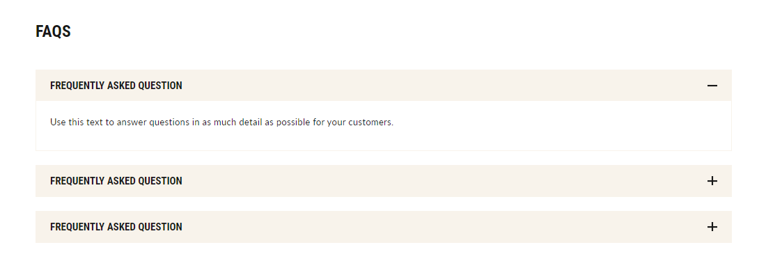
Collapsible content
This section shows the text content in collapsible form like FAQ. A maximum of 6 blocks can be added here.
Configure the collapsible content
- Go to Customize theme. At the top of the page, click on the dropdown menu to select a template that contains a collapsible content section. For example, select the Home page template.
- From the left side menu, select Collapsible content.
- Click the Collapsible row to add a new block.
- Customize this section by using the setting on the right side of the theme editor, as described in the following table.
| Heading | Add text to display as a title in the section. | |||||||||
| Section spacing |
|
|
||||||||
Collapsible content block settings
| Heading | Enter a suitable text to show as a title inside the collapsible row. |
| Description | Enter a suitable text to show as the content inside the collapsible row. |
Map
This section represents the map that can be used to show the store location.
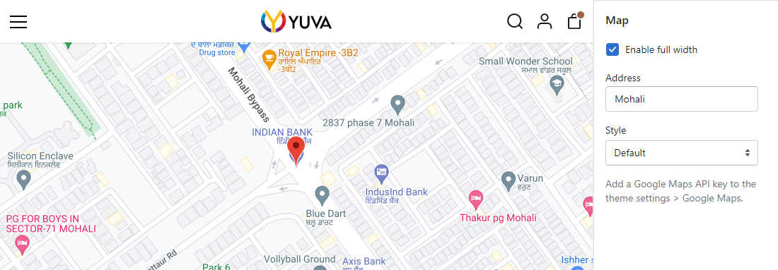
Configure the map section
- Go to Customize theme. At the top of the page, click on the dropdown menu to select a template that contains a map section. For example, select the Home page template.
- From the left side menu, select “Map.”
- Configure the section using the following settings:
Map settings
| Enable full width | Select this checkbox to show/hide the map in the full-width display. |
| Address | Type the address you want to show in the maps. |
| Style | Choose map style from given options such as default, satellite, hybrid, and terrain. To show the map, you have to add a ‘Google maps API key’ to the Theme settings > Google Maps section. |
Note: You must add the “Google maps API key” in the theme settings for the maps. To understand how to add the “Google maps API key,” refer to the below description.
Google Maps API key steps
Using API keys:
Google Maps platform products are protected from unauthorized use by limiting API calls to people with the proper authentication credentials. These are in the form of an API key – a unique alphanumeric string that associates a Google billing account with the project and the specific API/SDK.
This guide displays how to create, restrict, and use your API Key for the “Google Maps platform.”
Before you start:
Before you begin using the “Maps JavaScript API,” you need a project with a billing account and the “Maps JavaScript API” enabled. To understand more, see Set up in Cloud Console.
- Create a new: “Google cloud project” in the Cloud console: Create new project
- On the New project display, fill in the required details:
- Project name: Accept the default name or enter a customized name. You can change the project name at any time. For more information, see Identifying projects.
- Project ID: Accept the default or click on “EDIT” to add a “Customized ID” that “Google APIs” use as a unique identifier for the project. After users create the project, they cannot change the “Project ID,” so, select an IDthat you’ll be comfortable using for the project’s lifetime. Do not include any sensitive information in “Project ID.”
- Billing account: Choose a billing account for the project. You won’t see this option if you haven’t set up a billing account or only have one.
- Users must be a “Billing account administrator” or “Project billing manager” to associate a project with the billing account. For more details, refer to the billing access control documentation.
- Location: If users have an organization to link the project to, click Browse and select it; otherwise, choose “No organization.” For more details, check here Creating and Managing Folders and Relationships between organizations, projects, and billing accounts.
- Click on the Create button.
Creating API keys:
The API key is a UID (unique identifier), which authenticates all requests associated with the project for usage and the billing purposes. Users must have at least one API key associated with the project.
To create an API key:
- Open “Google Maps platform > Credentials page. For more details, refer to Go to the Credentials page.
- On the Credentials page, click on Create credentials > API key. The API key-created dialog displays your newly created API key.
- Click on the Close button.
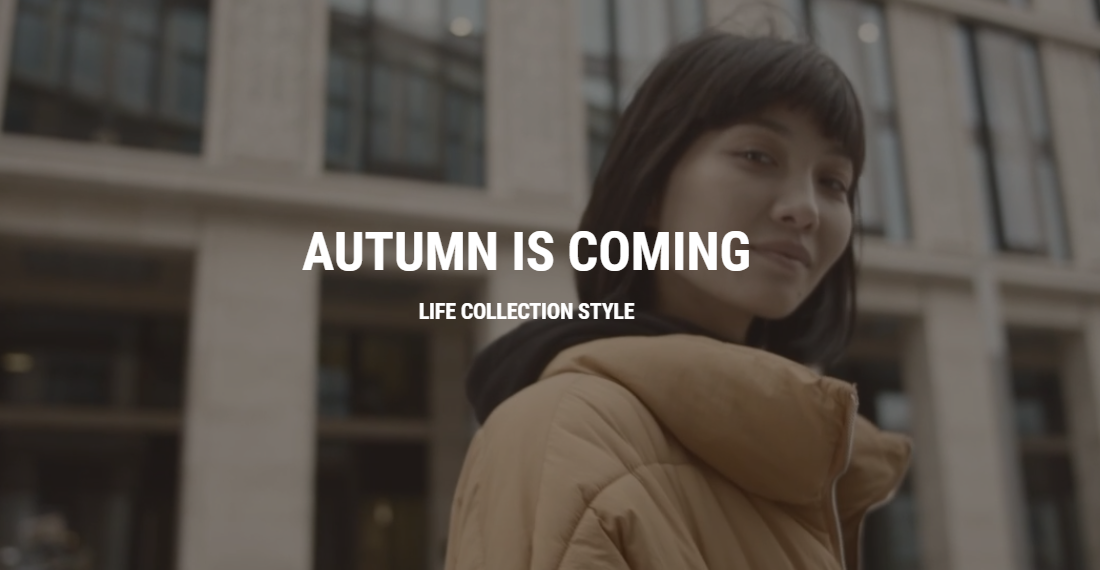
Video banner
Use this section to add relevant autoplay videos to your brand to attract customers. Users can add a heading, subheading, and a play button to make it charismatic.
Promotional banner
This section is used to highlight your promotional deals on the home page, allowing customers to experience exclusivity.

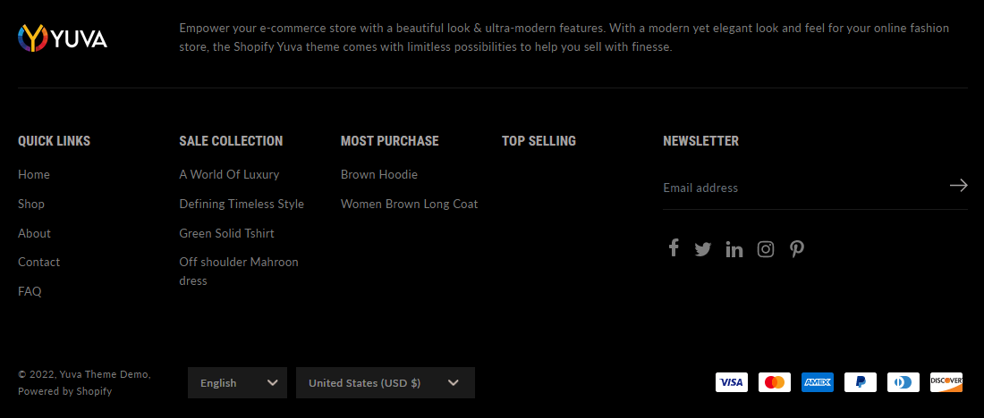
Footer
This is the bottom part of your web store. Use it to share brief information about your store and add navigation menus to help users navigate the web store quickly.
Configure the footer-
- Go to Customize theme. At the top of the page, click on the dropdown menu to select the Home page template.
- From the left side menu, select Footer.
- Customize this section by using the setting on the right side of the theme editor, as described in the following table.
| Logo | Use the logo selector option to set up an image to use as a logo inside the Footer. Image size of 235 x 74px (pixels) is recommended.
|
|||||||||
| Custom logo size | Adjust the slider Custom logo size to set a size for the logo image inside the section between 50px and 250px (pixels). | |||||||||
| Description | Enter the description that can be about the brand. | |||||||||
| Language selector |
|
|
||||||||
| Currency selector |
|
|
||||||||
| Payment methods |
|
|
||||||||
| Colors |
|
|
||||||||
Three types of blocks are available to customize the footer.
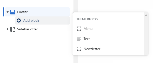
Menu –
Three types of blocks are available to customize the footer.
Menu block settings
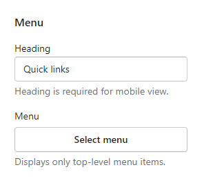
| Heading | Enter text to display as a title on the footer menus. For example – Quick links.
Please note that this heading is required to show navigation on mobile devices. |
| Menu | Use this menu option to set the navigation menu in the footer section.
Please note that it displays only first-level menus. Refer to Configure the footer menu. |
Text-
This text block can be used to show the brand story or any promotional text in the footer.
Text block settings
| Heading | Enter text to display as a title for the text content.
Please note that this heading is required to show text descriptions on mobile devices. |
| Description | Enter text to display as a description below the heading. |
Newsletter-
This block adds a newsletter with the social icons in the footer section. Please note that the newsletter block in the footer can be added only once.
Newsletter block settings
| Heading | Enter text to display as a title on the newsletter. |
| Show newsletter | Select this checkbox to show/hide the newsletter on the footer. |
| Placeholder | Enter text to display as a placeholder text on the input field of the newsletter. For example – Enter your email. |
| Social media icons | Select this checkbox to show the social media icons on the footer.
Please note that users need to link social media in Theme settings > Social. |
Configure the footer menu
- Go to Customize theme. Click on the top dropdown menu to select the Home page template.
- From the left side menu, expand the Footer section and click on Add block > Menu.
To use an existing menu, click on the Select menu. Type the menu’s name in the Search text box, or pick a menu from the list, and then choose Select menu.
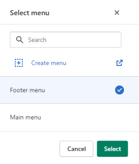
To create a new menu, click on the Select menu, and then click on the Create menu link. The link opens the Navigation > Add menu editor in the Shopify store’s admin page. Use the editor to create a new menu and save it.
For more understanding, refer to Shopify help: Add, remove or edit menu items in your online store.
Sidebar offer
This section represents the discounts offered by the merchants, which are displayed on the sides. You can create up to four offers.
Configure the offer
- Go to Customize theme. At the top of the page, click on the dropdown menu to select the Home page template.
- From the side menu, select Sidebar offer.
- Customize this section by using the setting on the right side of the theme editor, as described in the following table.
| Enable sidebar | Select this checkbox to enable the sidebar. |
| Heading | Enter text to display as a title on the Offer section. Example: Brand-new collection. |
| Subheading | Enter text to display as a subtitle on the Offer section. Example: Men collection. |
| Button text | Enter a button text for your offer section. We recommend adding a maximum of 16 characters to make the UI attractive. |
| Horizontal position | Adjust the slider to manage the space for the horizontal position of the offer on the page. |
| Vertical position | Adjust the slider to manage space for the vertical position of the offer on the page. |
Sidebar offer block settings
The block settings below are common to all offers.
| Heading | Enter text to display as a title on the Offer box. We recommend adding a maximum of 10 characters to show the appealing UI. |
| Highlighted text | Enter text to display as a high point subtitle on the Offer box. For example- 10% off. We recommend adding a maximum of 10 characters to show the appealing UI. |
| Image | Choose any image to set as a background image for the Offer box. An image size of 288 x 160px (pixels) is recommended for appealing UI. |
| Offer link | Enter a url to redirect the Offer box. The link opens when a store visitor clicks on this Offer box. |
Theme settings
This section is used to customize the Yuva theme for your Shopify store.
Configure the theme settings
- Go to Customize theme. At the top of the page, click on the dropdown to select the Home page template.
- Click on Theme Settings at the bottom to access theme-wide settings. Settings include:
Color
Color:From here, you can select the colors you want to use throughout the theme. Through this main setting, you perform the following settings:Primary color- Background- Select any color for the store background.
- Button background – Select any color for the background of the first buttons, like “Add to cart.”
- Button text- Select any color for the text of buttons.
Secondary Color
- Background: This background color works only with some specific sections like “Featured Posts,” “Featured Product,” “Image Gallery,” “Slider (if the split style is selected), “and “Rich Text.”
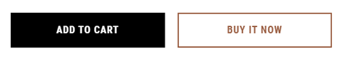
- Button background: This setting is for the background color of the second button where two buttons appear side by side, such as “Add to Cart and Buy Now” and “Save and Cancel.”
- Button text: This setting is for the text color of the second button where two buttons appear side by side, such as “Add to Cart & Buy Now” and “Save & Cancel.
Others
- Base – Select any color for the theme color.
- Text – Select any color for the text used in the theme.
- Headings – Select any color for the headings.
- Image background – Select any color for the background of images.
- Saved amount background – Select any color for the background of the “Saved amount” badge.
- Saved amount text – Select any color for the text of the “Saved amount” badge.
- Cart indicator – Select any color for the cart indicator that appears when you add a product to the cart
Typography
Typography: From here, you can make font-related customizations using different options.
| Headings |
|
|
||||||||
| Headings |
|
|
Social
Social: Use this setting to link your Shopify store to your social media handles.
| Add the link to your “Facebook” handle. | |
| Add the link to your “Twitter” handle. | |
| Add the link to your “LinkedIn” handle. | |
| Add the link of your “Instagram” handle. | |
| Add the link to your “Pinterest” handle. | |
| Snapchat | Add the link to your “Snapchat” handle. |
| TikTok | Add the link to your “TikTok” handle. |
| Tumblr | Add the link to your “Tumblr” handle. |
| YouTube | Add the link to your “YouTube” handle. |
| Vimeo | Add the link of your “Vimeo” handle. |
Search
Search: Customize search results using the following settings:
| Enable articles in results | Select the checkbox to show/hide the articles tab in search results. |
| Enable pages in results | Select the checkbox to show/hide the pages tab in search results. |
Cart drawer
Cart drawer: Customize the look and feel of the cart drawer using the following settings:
| Enable cart drawer | Select the checkbox to show/hide the cart drawer in your store. |
Breadcrumbs
Breadcrumbs: Merchants can show or hide the breadcrumbs from the storefront using this setting.
| Enable breadcrumbs | Select the checkbox to show/hide the breadcrumbs of the page on the store. |
Product
Product: Using these settings, you can customize your product listings on your Shopify store.
| Enable preorder | Select the checkbox if you want to allow users to pre-book any product. For this option, you must ensure that the “Continue Selling Out of Stock” is checked for a product that is not in stock at that moment. This setting can be checked from the Shopify products page.
|
| Option style | Select from the dropdown style in which you want your product listings to appear. Options include dropdown and swatch. |
| Color swatch style | Choose from the dropdown style in which you want to show your color swatch style.
Follow the below procedure to set up custom color swatches:
Rules to follow for image upload for color swatch:-
Here is a collection of examples:-
|
| Show color option as variant image | Select this checkbox to display product variants as images, not colors. For this to work, users need to add variant images from the Shopify products page. Refer to Product details. |
| Show saved amount | Select this checkbox to display the saved amount badge. |
| Saved amount style | Choose from the dropdown how you want the saved amount to be displayed as a percentage or amount. |
Product grid
Product grid: Manage the look and feel of product grids using the following settings.
| Enable quick view | Select this checkbox to show/hide a quick view icon on the products. |
| Enable similar products | Select this checkbox to show similar product icons on products. |
| Show similar button text on hover | Select this checkbox to “show similar button text on hover” instead of icons on products. |
| Enable Add to cart | Select this checkbox to show the “Add to cart” icon on products.
Note: The “Add to cart” icon will appear if the product has a single variant. However, if the product has multiple variants, the icon will not be visible. |
| Show product price | Select this checkbox to show/hide the price of products. |
| Show reviews | Select this checkbox to show/hide reviews of products. |
| Action on product image hover | Select “None,” “Carousel,” or “Second image” to show on hover of the product image. |
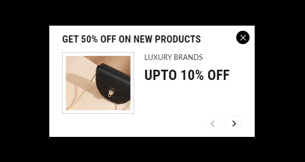
Newsletter popup
Newsletter popup: Manage the look and feel of your newsletter pop-ups using the following settings:
| Enable newsletter popup | Select the checkbox to display a newsletter pop-up on the storefront. | |||||||
| Image | Select an image for your newsletter section. | |||||||
| Heading | Add text to display as a title on the “Newsletter pop-up” section. | |||||||
| Description | Add text to display as a brief about the newsletter section. | |||||||
| Colors |
|
|
||||||
| Set cookie for newsletter popup(days) | Set the time (days) for which you want the cookies to expire. For example, if you set the time as two days, and the user closes the newsletter popup or submits their email for subscription, after two days, the popup will re-appear on the storefront for that user. | |||||||
Favicon
Favicon: These are tiny icons that appear in browser tabs, address bars, and bookmarks menus near your site’s url or title. Users can upload favicon icons by clicking on the Change button under the favicon setting.
Please note that an image size of 16 x 16px (pixels) is recommended.
Scroll to top
Scroll to top: This setting enables/disables and shows/hides the text. It is also used to add custom “SVG code” to add a custom “Scroll to top” button to your site.
| Enable | Select this checkbox to enable the “Scroll to top” icon. |
| Show text | Select this checkbox to display “Scroll to top” on the icon. |
| SVG code | Enter “SVG code” to show a custom icon.
Please note that ‘SVG’ should have width and height attributes. |
Google Map API Key
Google Maps API Key: This setting is for adding the Google maps API key for the Maps section to function correctly. To learn the way to get the “Google maps API key,” please check this tutorial.
Checkout
Checkout With these settings, you can change the look and feel of the checkout page.
| Banner |
|
|
||||||||||
| Logo |
|
|
||||||||||
| Main content area |
|
|
||||||||||
| Main content area |
|
|
||||||||||
| Typography |
|
|
Template-Collection list
This page will automatically list all the current collections in your store. By default, all collections will be listed alphabetically.
- Go to Customize theme. At the top of the page, click on the dropdown menu to select a collection list template.
- From the left side menu, select “Collections list page.”
- Click on “Add Collection” to add collection blocks.
- Customize this section by using the setting on the right side of the theme editor, as described in the following table.
| Heading | Enter text to display as a title on the collection page. | |||||
| Banner image | Select an image to be shown on the banner. Image size of 1916 x 200px (pixels) is recommended. | |||||
| Collections per page | Set the number of collections to be displayed per page. | |||||
| Show collections | Select the “All” or “Selected” radio button to list and display all or selected collections on the page. | |||||
| Sort collections by | Choose an option from the list to sort your collection list. The list includes options such as
|
|||||
| Colors |
|
|
||||
For each collection added to this page, use the following settings:
| Select collection | Import the collection you want to showcase in the existing collection list.
To understand collections, refer to Collections. |
|
| Select image | Select an image for the current collection list. | |
Template-Main collection (Catalog)
This page will list all the products in your collection list. Users can choose to sort or filter the product listings on this page using various options.
- Go to Customize theme. Click on the top dropdown menu to select Collection > Default collection template.
- From the menu on the left, select “Main collection.”
- Customize this section by using the setting on the right side of the theme editor, as described in the following table.
| Show collection title | Select this checkbox to show/hide the collection title on the page. | |||||||
| Show collection description | Select this checkbox to show/hide the collection description on the catalog page. | |||||||
| Show collection image | Select this checkbox to show/hide the collection image on the page. | |||||||
| Default collection image | Select any image to keep as the default image.
Note: This image shows when the collection does not have any products and the collection image is added from the backend. Also, the show collection image should be selected. To summarize, the first priority is given to the image added from Shopify collections, the second is given to the image of the added products, and the last is given to the custom image. Also, an image size of 1916 x 200px (pixels) is recommended. |
|||||||
| Pagination type | Choose from paged navigation or infinite scrolling here. | |||||||
| Products per page | Adjust the slider to select a number of products per page. The minimum product count is 8, and the maximum is 25. | |||||||
| Filtering and sorting |
|
|
||||||
Template-Default product
The Default product page allows you to add shape and control the appearance of products.
- Go to Customize theme. Click on the top dropdown menu to select the Products > Default product template.
- From the left side menu, select “Product page.”
- Customize this section by using the setting on the right side of the theme editor, as described in the following table.
| Gallery style | Select any different style from the drop-down menu to display product media on the product page. Options are
|
|||||
| Show product description | Select this checkbox to show/hide the product description on the page. | |||||
| Content |
|
|
||||
| Custom content |
|
|
||||
It has the following types of blocks:
| Title | It displays the product’s title. It has no customizable block settings available. | |||||
| Text | Enter additional text to display. To display dynamic data like product Title or Vendor, select the Insert dynamic source icon shown next to the Text box and select any metafield to add here.
For more understanding, refer to Metafields. |
|||||
| Review rating | It displays customer reviews and ratings. These reviews can be included by adding the Shopify reviews app. | |||||
| SKU | It displays the product SKU.
Refer to Product details. |
|||||
| Price | Select this checkbox to display the product’s price like Sale and Compare price. There are no customizable block settings available. | |||||
| Variant picker |
|
|
||||
| Quantity selector | Select this checkbox to display a quantity selector, for selecting the number of products to purchase. It has no customizable block settings available. | |||||
| Buy button |
|
|
||||
| Social sharing | This displays social icons to share products on these channels. | |||||
| Custom liquid | This is used to add custom liquid code for any advanced customizations such as app snippets.
For more understanding, refer to Shopify developers: Liquid reference. |
|||||
Recommended products
If a customer redirects to a product page from your store, related products will be shown in the product recommendation section.
Note – The “Product recommendation” section is only available on the default product and feature pages.
- Go to Customize theme. At the top of the page, click on the dropdown menu to select the Products > Default product template.
- From the left side menu, select “Product recommendations.”
- Customize this section by using the setting on the right side of the theme editor, as described in the following table.
| Heading | Add text to display as the title on the product recommendations. | |
Template-Default blog
This is the page where published blogs can be viewed and read.
- Go to Customize theme. At the top of the page, click on the dropdown menu to select the Blog posts > Default blog posts template.
- From the left side menu, select “Blog post.”
- Customize this section by using the setting on the right side of the theme editor, as described in the following table.
| Show article image | Select this checkbox to show/hide the article image on the page. |
| Show article published date | Select this checkbox to show/hide blog publication date. |
| Show article author | Select this checkbox to show/hide details about the article’s author. |
| Show social share icons | Select this checkbox to show/hide the social media icons. |
| Show article tags | Select this checkbox to show/hide tags applied to the article. |
| Show related articles | Select this checkbox to show/hide the filtered list of similar articles. |
To understand more about blog posts, please refer to Shopify blog posts.
Template-Cart
This page shows all the products that the customers choose to buy.
- Go to Customize theme. Click on the top dropdown menu to select the Cart template.
- Click on the “Main cart” from the left side menu.
- Customize this section by using the setting on the right side of the theme editor, as described in the following table.
| Show cart note | Select this checkbox to show/hide cart notes on the page. |
| Show payment icons | Select this checkbox to show/hide payment icons. These are shown by enabling the Shopify payments.
For a detailed understanding, please refer to Shopify payments. |
| Enable shipping estimations | Select this checkbox to show/hide the estimate shipping on the cart page.
To understand shipping rates, please refer to Shopify shipping rates. |
Template-Password
These are the settings to customize the password page.
- Go to Customize theme. Click on the top dropdown menu to select the Others > Passwordtemplate.
- Click on the “Password page” from the left side menu.
- Customize this section by using the setting on the right side of the theme editor, as described in the following table.
| Logo | Use the logo selector option to set up an image to use as a logo. Image size of 110 x 36px (pixels) is recommended.
|
| Custom logo size | Adjust the slider Custom logo size to set a size for the logo image inside the section between 100px and 400px (pixels). |
| Heading | Enter suitable text to display as a title on store’s Password page. option is enabled. |
| Show newsletter | Select this checkbox to show/hide the newsletter on store’s Password page. |
| Newsletter heading | Enter suitable text to display as a title on the newsletter added as above. |
| Show social media icons | Select this checkbox to show/hide the social media icons.
Note: Users need to link social media in Theme settings > Social. |