


Table of Contents
- Introduction
- What are Mobile Apps?
- What are the Pros and Cons of Mobile Apps?
- What are Responsive Websites?
- What are the Pros and Cons of Responsive Websites?
- Understanding the Difference Between a Mobile App and a Website
- Factors to Consider When Choosing Between a Mobile App and a Responsive Website
- What are the Best Practices for Mobile App Design?
- What are the Best Practices for a Responsive Website?
- Summing Up
Businesses often face a crucial decision: should they invest in a mobile app or a responsive website? With the increasing reliance on mobile devices for browsing and shopping, understanding the differences between mobile app design and mobile-responsive web design is essential. This blog explains the pros and cons of each option, provides a detailed comparison, and helps you determine the best choice for your business’s digital presence.
What are Mobile Apps?
A mobile app is software designed specifically for mobile devices like smartphones and tablets. These apps are downloaded from app stores (like Google Play or Apple App Store) and built to take advantage of the device’s features, such as the camera, GPS, and push notifications.
To ensure that your mobile app functions seamlessly and provides essential benefits and increased user experience, you can hire mobile app builders to ensure perfection and consistency in work. For this, Monster, a Shopify mobile app builder, is an excellent choice for growing your business.
What are the Pros and Cons of Mobile Apps?
Pros of Mobile Apps
Improved Performance:
Mobile apps load faster and have smoother interactions because they can cache locally on the device.
High-Density User Engagement:
With push messages and others, apps interact with users and keep them informed, driving engagement and retention.
Access to Device Capabilities:
Take advantage of device features like cameras, GPS, accelerometers, and biometric sensors to provide a more robust user experience.
Offline Access:
Offline Access: Most apps provide functionality without the need for a continuous internet connection, so users can access information anywhere.
Cons of Mobile Apps
Higher Development Cost:
Mobile app development and design can be time-consuming, especially when building for multiple systems like iOS and Android.
App Store Approval Delays:
Approval via app store review processes takes time, thereby delaying your launch.
User Acquisition Challenges:
User Acquisition Challenges: Convincing users to install your app requires excellent marketing and value propositions.
Regular Updates Needed:
Apps must be updated with bug fixes, security patches, and feature additions, which take time.
What are Responsive Websites?
A responsive website adopts a design approach that enables the content & layout to adjust seamlessly based on the user’s device screen size and orientation. Whether visitors access your site from a desktop, tablet, or mobile phone, the website remains functional and attractive, delivering a consistent user experience.
Some Examples of Responsive Websites:
Many inspiring responsive website examples showcase how effective mobile-responsive web design can be. Here are some notable ones:
Apple – Apple’s site smartly adapts across devices, showcasing products with beautiful imagery and seamless navigation.
The New York Times – A content-heavy responsive website that remains readable & navigable on every screen size.
Shine Dezign Infonet – Shine Dezign’s website showcase a sleek and modern digital presence designed to engage users across all devices.
Airbnb – Combines elegant design with dynamic content tailored for mobile users.
Tesla – Delivers an immersive experience optimized for both desktop & mobile viewers.
Studying these sites can inspire your approach to mobile-responsive website development and highlight the potential for website and mobile harmony.
What are the Pros and Cons of Responsive Websites?
Pros of Responsive Websites:
Cost-Effective Development:
A single website that adapts to several devices without needing separate codebases saves costs.
No Install Required:
Users can access your site directly on any device without downloading.
Real-Time Updates:
Content and design changes are reflected immediately without users waiting for anything to be updated.
Cons of Responsive Websites:
Limited Device Feature Access:
Responsive websites cannot fully utilize native mobile features like sensors or specialized hardware.
Lower Engagement:
Lower Engagement: Sustaining user engagement can be more difficult without push notifications.
Dependence on the Internet:
Users require an active connection to access content and features on responsive websites.
Understanding the Difference Between a Mobile App and a Responsive Website
Here is the comparison table to distinguish between the mobile app and a mobile-responsive website:
| Feature | Mobile App | Responsive Website |
|---|---|---|
| Development Cost | Higher | Lower |
| User Engagement | High (Push Notification) | Moderate (Less Notifications) |
| Performance | Generally Faster | It may be slower on mobile devices |
| Access to Device Features | Yes | Limited |
| Offline Access | Yes | No |
| SEO Benefits | Limited | High |
| Updates & Maintenance | More Complex | Easier |
| User Acquisition | More Challenging | Easier (No Downloading Required) |
Factors to Consider When Choosing Between a Mobile App and a Responsive Website
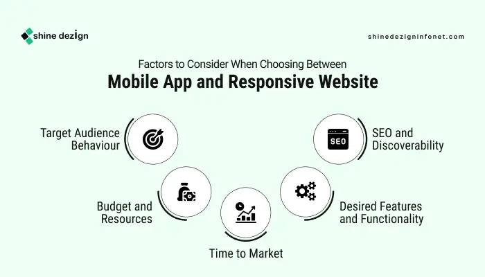 Choosing between a mobile app vs a mobile website depends on your business goals, audience, budget, and timeline. Here are some critical factors to assess:
1. Target Audience Behaviour:
If your audience prefers frequent and personalized interaction, a native mobile app can provide better engagement through push notifications and offline access. Conversely, if your audience values quick information access without installation friction, a responsive mobile website may be best.
2. Budget and Resources:
Responsive websites have lower upfront development costs and require less maintenance. Mobile apps require budget allocation for multi-platform development (iOS, Android), store submission, and ongoing updates.
3. Desired Features and Functionality:
Need access to device capabilities like camera integration, GPS tracking, or AR features? Then, the mobile app design is the way to go. For simpler content-focused needs, a mobile-responsive website with an innovative design can suffice.
4. Time to Market:
Responsive websites can be deployed faster and updated instantly. Mobile apps need a longer development cycle, plus app store approval.
5. SEO and Discoverability:
Responsive websites are better for SEO and can attract organic traffic. Apps rely on app store search and need marketing efforts for visibility.
What are the Best Practices for Mobile App Design?
 A proper mobile app design achieves harmony between functionality and usability. The following are best practices in mobile app design to remember when designing your app or weighing app options:
Adaptive and Responsive Mobile App Design:
Design interfaces that adjust seamlessly to various screen sizes and orientations, ensuring a consistent user experience on smartphones and tablets. This adaptability enhances usability and keeps users engaged, regardless of their device.
Simple and Intuitive Navigation:
Implement straightforward and predictable navigation to help users find what they need quickly. Familiar icons and clear labels reduce frustration and encourage exploration, creating a more satisfying user experience.
Performance Optimization:
Focus on quick load times and responsive interactions to meet user expectations. Optimize images and minimize HTTP requests to ensure the app runs smoothly, enhancing user satisfaction and retention.
Offline Functionality:
Enable offline access to essential features, allowing users to interact with the app without an internet connection. This functionality increases reliability and user engagement, especially in areas with poor connectivity.
Accessibility:
Design inclusive apps that support users with disabilities by incorporating features like screen reader compatibility and sufficient color contrast. Prioritizing accessibility ensures a broader audience can use your app effectively.
Consistent Branding:
Maintain brand consistency through cohesive colors, typography, and iconography. This reinforces brand identity and creates a visually appealing experience, helping users feel familiar and connected to your app.
Focusing on responsive design for mobile apps principles enhances engagement and user satisfaction, making your app a valuable asset to your business.
What are the Best Practices for a Responsive Website?
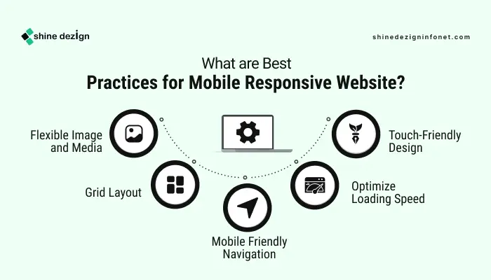 Here are a few points to consider while creating a mobile-responsive website design for enhanced user experience and business development:
Flexible Image and Media:
Implement responsive images that automatically adjust to fit the screen size. Use proper techniques to ensure the image scales down properly without compromising the quality. This prevents the images from overflowing their containers and maintains a clean design.
Grid Layout:
Utilize grid layouts that use relative units (like percentages) instead of fixed units (like pixels). This allows the website’s elements to resize proportionally based on the screen size, ensuring a consistent and visually appealing layout across all devices.
Mobile-Friendly Navigation:
Design an intuitive and accessible navigation that works well on smaller screens. Consider using hamburger menus or collapsible navigation bars to save space while ensuring users can easily find what they need. Clear and concise labels enhance usability and improve the overall user experience.
Optimize Loading Speed:
Optimizing images, minimizing HTTP requests, and leveraging browser caching will ensure your responsive website loads quickly on all devices. A fast-loading site reduces bounce rates and improves user satisfaction, which is crucial for retaining visitors on mobile devices.
Touch-Friendly Design:
Design interactive elements, such as buttons and links, to be touch-friendly. Ensure that buttons are large enough to be easily tapped and spaced adequately to prevent accidental clicks. This consideration enhances usability and provides a better experience for mobile users who rely on touch navigation.
Summing Up
The question of mobile app vs responsive website doesn’t have a straightforward solution. A consideration of your target audience, objectives, budget, and desired functionality will determine whether you go for a mobile app or a responsive web design. For most businesses, investing in a solid mobile-responsive web design is a savvy, cost-effective way of engaging with all customers across devices.
But if your business demands in-depth device integration, immersive experiences, and high-frequency customer interactions, expert mobile app design and development may yield better returns. Sometimes, embracing a hybrid strategy—blending a responsive website with a well-designed mobile app—can offer the strengths of both, with extensive reach and rich, personalized user experiences.
Underlying these choices is the tenet of prioritizing your users through smart, responsive mobile app design or properly optimized, accessible responsive websites. By perfecting this equilibrium, your online presence will flourish in today’s mobile-led world.